Pantone Color Trends for Autumn Winter 20/21

Pantone Color Trends for Autumn Winter 20/21

Where does the forecast come from?

As every year, at Smart Room Barcelona we rescue the forecast of the Pantone Colour Institute, which publishes its report on ‘colour trends’ for each season. The world of fashion, design, and graphic communication feed on these forecasts to focus their colour vision. An example of this would be the New York or London Fashion Weeks. These are events where these influences are directly seen on the catwalk.

Image from the Pantone Color Institute

In addition to the ‘colour of the year’ (which for 2020 has been Classic Blue), this forecast includes other colours that make up a kind of ‘complementary palette’, according to the seasonal periods.

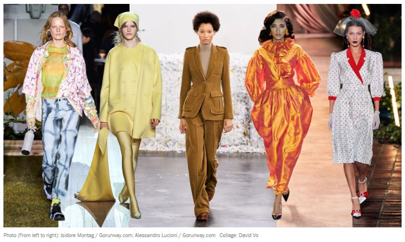
The set of tones for Autumn / Winter 2020/2021 has 9 members who, according to the institute itself, “have a special strength; combined with the central tone of the season they create a classic and fresh colour palette”.

The warm pallette for Autumn Winter 20/21

The references are described by the Pantone Colour Institute as below:

  • PANTONE 19-4052 Classic Blue. (Infinite blue, evocative of the vast and infinite night sky that opens us to a world of possibilities). This is the central tone of 2020.
  • PANTONE 16-1350. Amberglow. (Radiant autumnal orange that encourages self-confidence and creative expression.)
  • PANTONE 19-1662. Samba. (Sensual and voluptuous red that transmits optimism and energy).
  • PANTONE 16-1328. Sandstone. (Earthly color linked to nature that speaks of outdoor country experiences).
  • PANTONE 13-0648 Green Sheen. (Optimistic and rebellious, it is a green-yellow, daring and acid tone, that always attracts attention).
  • PANTONE 16-1511 Rose Tan. (gentle and subdued rose that conveys a sense of composure).
  • PANTONE 18-5338 Ultramarine Green. (Deep and refreshing teal, emanate self-confidence and poise).
  • PANTONE 19-1337. Fired Brick. (Strong and resistant, adds transcendence and sobriety).
  • PANTONE 14-1220. Peach Nougat. (Tone that embraces with cozy warmth).
  • PANTONE 19-2428. Magenta Purple. (Hypnotic purple tone that intrigues and fascinates).

What about the 'blue feeling' of Classic Blue?

Despite the fact that the Classic Blue already conveyed a strange foreboding sense of how complex 2020 was going to be, the rest of the palette has hints of optimism. It tries to generate a certain feeling of well-being and warmth.

Will the end of the year be more comforting than the beginning? Will be able to apply this colour trend in campaigns or marketing actions for your brand or product?

Date: 2023-08-02