

International "Fashion Weeks" are here again! The best of the fashion industry is brought together on the catwalks in different cities around the world. Along with them, we have the trend forecast for late 2021 and early 2022.
Let's remember that just as the events calendar, design and fashion trends are always launched semesters in advance.
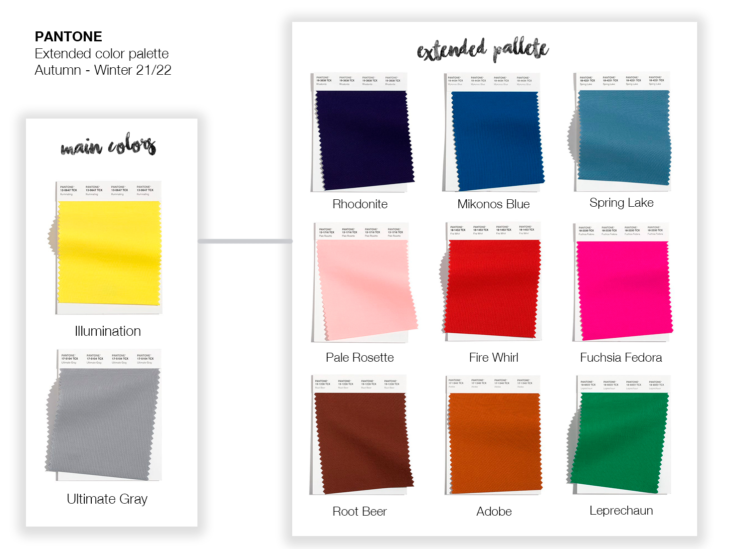
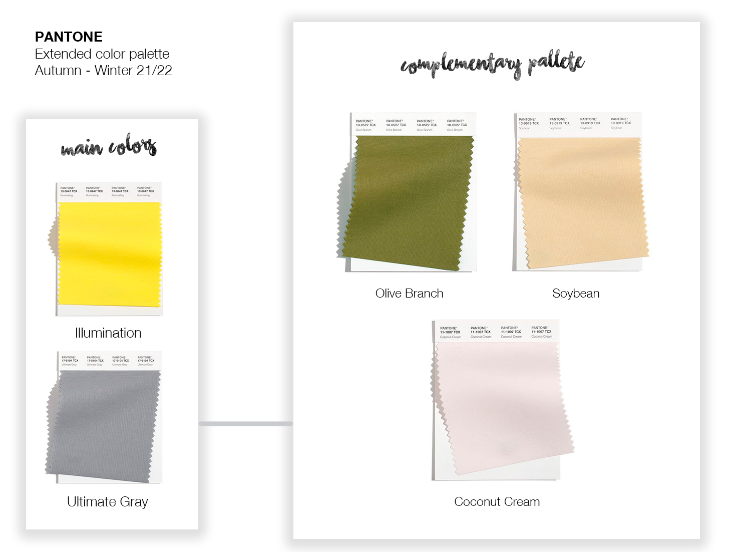
For example, we knew months ago that 2021 would be a year for optimism, but keeping feet on the ground. Thus, Pantone proposed colours Yellow "Illuminating" and "Ultimate Gray" as two opposite but complementing trends. Yellow as a sign of happiness for the little big achievements, as a desire for happiness, or as "a promise for a new day". On the other hand, gray as a sign of firmness, conservatism, planification or reliability.
During the evolution of the year, trends are nourished by new facts, discoveries, news, etc. All which is valid for the first half of the year, has evolved when the second half is here. In this sense, Pantone Institute of Colour has launched a series of complementary colours for the originals of 2021, based on which has been presented in different events. For example, New York Fashion Week.
Would you like to know the origin of these colours?
We give you a small summary of the meaning of these new hues, which are complementary for the Illuminating Yellow. Ideal colours to catch attention or to generate visual accents.

And of course, the complementary colours for the Ultimate Gray. These hues grand a neutral base. They are ideal to apply as a background.

How can we incorporate this colour palette into an interior design project? Get in touch with our interior design division at Smart Room Barcelona: we can offer you ideas so that your home or office have an attractive and cozy design, following the last colour trends.