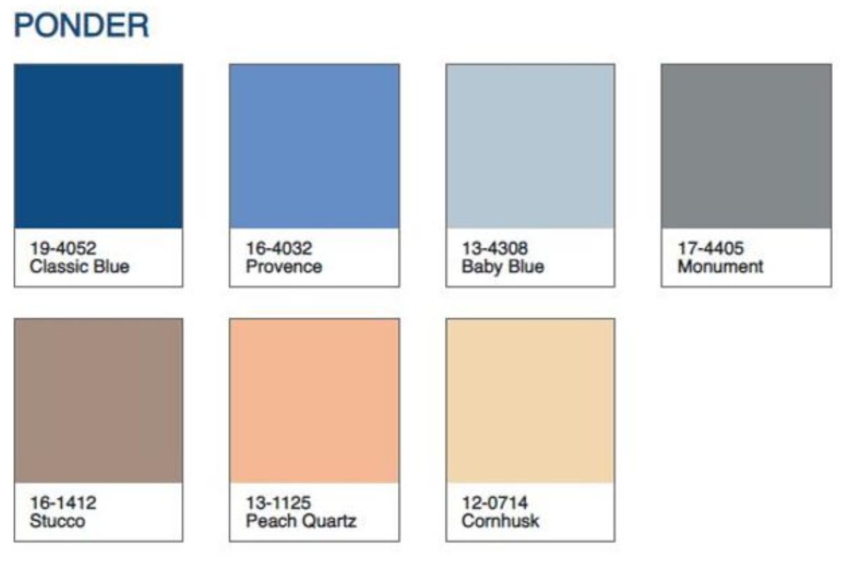


Pantone has released by the end of 2019 its yearly inform about the color of the year 2020: Classic Blue (19-4052)
This is a deep colour which, according to the Pantone staff, transmits ‘calmness, confidence and connection’ . It might even bring a feeling of ‘trust and faith’, according to Leatrice Eiseman, CEO at the Pantone Colour Institute.

These are important values to cope with these times full of uncertainty in many senses: changes in Economy, social chaos, political instability, climate emergency.
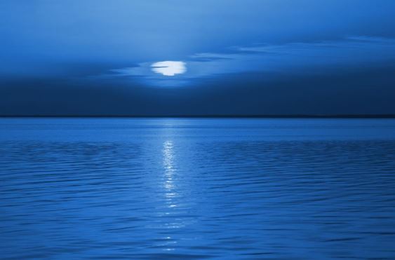
This is a soothing colour, which at the same time describes infinity: the sky, the sea, dreams and melancholy. It can also be linked to sadness. And some people even relate it directly to Generation Z.
A look into the website https://color-of-the-year.com/classic_blue can help us to see how to combine this colour harmonically.

Can we incorporate these group of hues into your design project this year? Can they be an inspiration for your marketing campaign, your event, your stand?