


Why is pink design controversial? Some colours seem to generate consensus when choosing options for interior design or product design. For example, there are several shades of blue that carry a perception of states of serenity, tranquility, reliability. It might look like a "safe" colour.
But on the other hand there are some colours that generate controversy, such as pink. For some reason it is associated more with emotions and feelings. And this could lead us to the old clichés to qualify it as romantic, sweet, sensual, or feminine. Pink design: is it a taboo?
Do colors really have a fixed meaning? Can we explore some connotations of pink a little more in depth? Let's see some examples of its application.
Colour Sexualisation
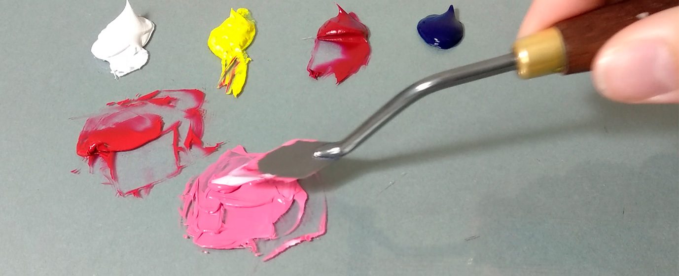
In pigment colors, pink is actually a variant of the secondary color "red", to which white has been added.
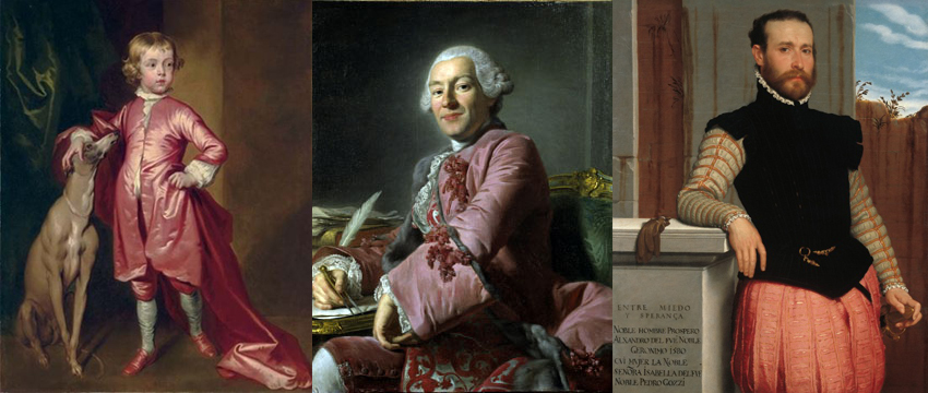
According to sources from the Fashion Institute of Technology in New York, "... if you go back to the 18th century, boys and girls from the upper classes used pink, blue and other colors indistinctly."
According to Leatrice Eiseman, director of the Pantone Institute, pink was considered a masculine color, which, being related to red, was associated with passion, blood, activeness and aggressiveness.
Apparently the shift to the opposite meaning began to dominate after World War II, and crystallized in the 1980s with mass marketing.
Pink Stone and Facades
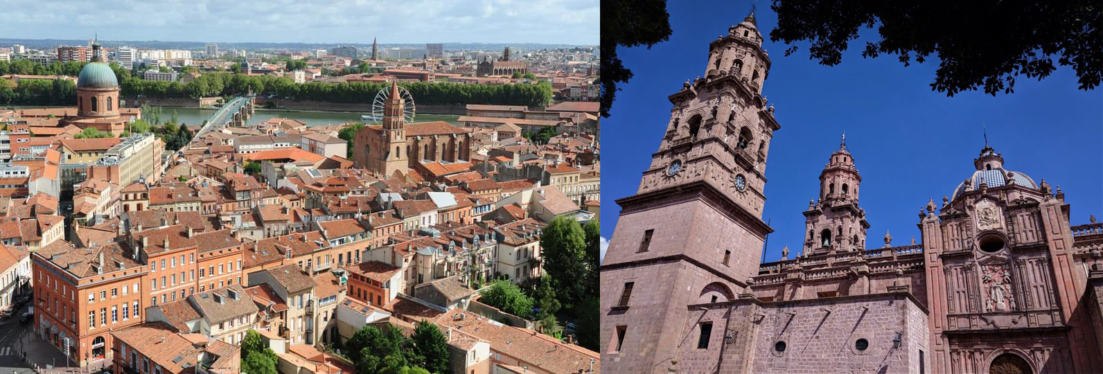
History gives us some notable examples of pink mineral architecture. A good example is the medieval old town of Toulouse (marble), or several colonial cities in Latin America (quarry).
In the 20th century, Art Deco, a style of French origin generated in the period “between wars” (1920-1940), had its peak in Europe and the United States. As an architectural and decorative style, it emphasized the decorative form over the structure. One of its characteristics was the intense use of geometric figures, and the taste for exuberant and striking colors. Among which we find notorious examples in pink.

Barragán and “Mexican Pink”
Luis Barragán, the first Mexican to win the Pritzker Prize (the "Oscar" of Architecture), always had a place for pink in his works. His famous “Casa Rosa” (Casa Gilardi, 1976), as other works, features series of surfaces and shadows. Even if structural minimalism is also present, there is a tribute to the vibrant folkloric colors of Mexico. The tone which is known today as “Mexican pink” is also a characteristic hallmark of Barragan's architecture, and of his predecessors', such as Ricardo Legorreta.

La Muralla Roja in Calpe
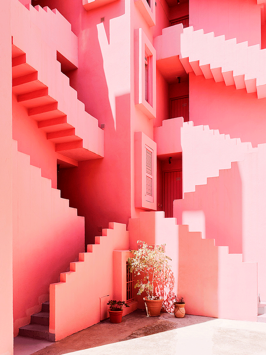
The “Instagram” phenomenon has made this building located in Spain super popular. Designed by Ricardo Bofill in 1973 and inspired by the Mediterranean architectural tradition, its geometric shapes recall the works of Escher. Its vibrant colors (among which we find a range of pink) have made it very popular. Does the color range and geometric shapes have something to do with the taste of so many millennials for this architectural work?
Memphis Style
An eccentric decorative style emerged during the 80's decade. It broke the rules of rational and "good design" which the Bauhaus proposed decades earlier in Germany. According to Houzz website, "the Memphis style is a philosophy that moves away from the sober and rationalist patterns that dominated much of the 20th century." Its members generated colorful and groundbreaking proposals. It was based on the mixture of styles. But also in the mixture of materials, colors and trends. Pink as a “groundbreaking” element gains strength in this movement.
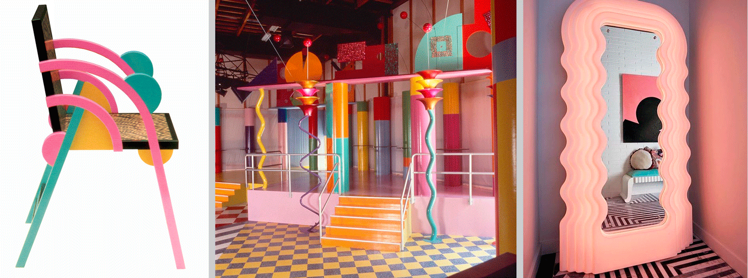
“Millenial” Pink
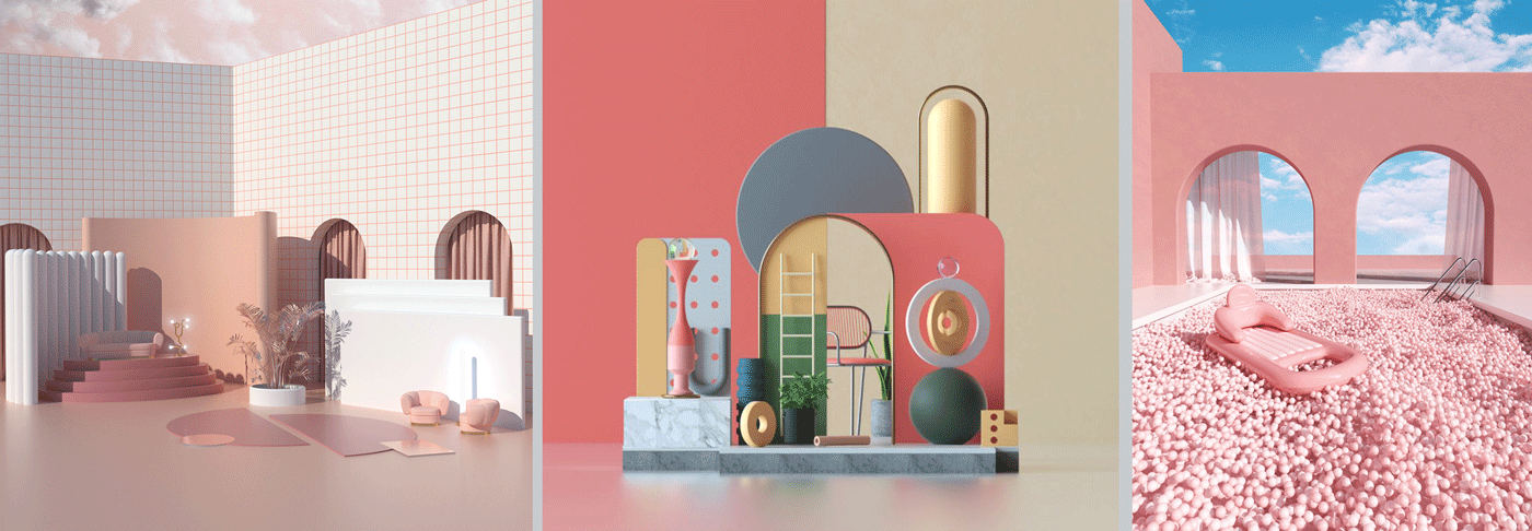
There are those who speak of the "Neo-Memphis" in the late 2010s, as a reinterpretation of the style of the 80s. Nontheless, here everything is softer and sweeter, more pastel. Some call it pink design.
Visual arts, which are nourished by digital technology, allow the generation of 3D images that represent impossible geometries made of noble materials (marble or wood), iridescent textures, very high brightness, and of course, ranges of colors where pink is still present. Does anyone know why this appeals to younger people?
Thinking about incorporating pink design into your projects? Check with Smart Room Barcelona. We can perform 3D visualizations to help you apply better this powerful design element.